
THE POST-TOWER ERA – A FAIRYTAIL.
From the bustling streets of New York to the remote highlands of Mongolia, the skyline had visibly changed. Where steel towers and antennas once dominated now stood open spaces and restored natural ecosystems. Forests reclaimed their natural habitats, and birds nested in trees undisturbed by the scaring of high rural cellular towers. This transformation was not sudden but resulted from decades of progress in satellite technology, growing demand for ubiquitous connectivity, an increasingly urgent need to address the environmental footprint of traditional telecom infrastructures, and the economic need to dramatically reduce operational expenses tied up in tower infrastructure. By the time the last cell site was decommissioned, society stood at the cusp of a new age of connectivity by LEO satellites covering all of Earth.
The annual savings worldwide from making terrestrial cellular towers obsolete in total cost are estimated to amount to at least 300 billion euros, and it is expected that moving cellular access to “heaven” will avoid more than 150 million metric tons of CO2 emissions annually. The retirement of all terrestrial cellular networks worldwide has been like eliminating the entire carbon footprint of The Netherlands or Malaysia and leading to a dramatic reduction in demand for sustainable green energy sources that previously were used to power the global cellular infrastructure.
INTRODUCTION.
Recent postings and a substantial part of commentary give the impression that we are heading towards a post-tower era where Elon Musk’s Low Earth Orbit (LEO) satellite Starlink network (together with competing options, e.g., ATS Spacemobile and Lynk, and no, I do not see Amazon’s Project Kuiper in this space) will make terrestrially-based tower infrastructure and earth-bound cellular services obsolete.
T-Mobile USA is launching its Direct-to-Cell (D2C) service via SpaceX’s Starlink LEO satellite network. The T-Mobile service is designed to work with existing LTE-compatible smartphones, allowing users to connect to Starlink satellites without needing specialized hardware or smartphone applications.
Since the announcement, posts and media coverage have declared the imminent death of the terrestrial cellular network. When it is pointed out that this may be a premature death sentence to an industry, telecom operators, and their existing cellular mobile networks, it is also not uncommon to be told off as being too pessimistic and an unbeliever in Musk’s genius vision. Musk has on occasion made it clear the Starlink D2C service is aimed at texts and voice calls in remote and rural areas, and to be honest, the D2C service currently hinges on 2×5 MHz in the T-Mobile’s PCS band, adding constraints to the “broadbandedness” of the service. The fact that the service doesn’t match the best of T-Mobile US’s 5G network quality (e.g., 205+ Mbps downlink) or even get near its 4G speeds should really not bother anyone, as the value of the D2C service is that it is available in remote and rural areas with little to no terrestrial cellular coverage and that you can use your regular cellular device with no need for a costly satellite service and satphone (e.g., Iridium, Thuraya, Globalstar).
While I don’t expect to (or even want to) change people’s beliefs, I do think it would be great to contribute to more knowledge and insights based on facts about what is possible with low-earth orbiting satellites as a terrestrial substitute and what is uninformed or misguided opinion.
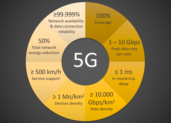
The rise of LEO satellites has sparked discussions about the potential obsolescence of terrestrial cellular networks. With advancements in satellite technology and increasing partnerships, such as T-Mobile’s collaboration with SpaceX’s Starlink, proponents envision a future where towers are replaced by ubiquitous connectivity from the heavens. However, the feasibility of LEO satellites achieving service parity with terrestrial networks raises significant technical, economic, and regulatory questions. This article explores the challenges and possibilities of LEO Direct-to-Cell (D2C) networks, shedding light on whether they can genuinely replace ground-based cellular infrastructure or will remain a complementary technology for specific use cases.
WHY DISTANCE MATTERS.
The distance between you (your cellular device) and the base station’s antenna determines your expected service experience in cellular and wireless networks. The longer you are away from the base station that serves you, in general, the poorer your connection quality and performance will be, with everything else being equal. As the distance increases, signal weakening (i.e., path loss) grows exponentially, reducing signal quality and making it harder for devices to maintain reliable communication. Closer proximity allows for more substantial, faster, and more stable connections, while longer distances require more power and advanced technologies like beamforming or repeaters to compensate.
Physics tells us how a signal loses its signal strength (or power) over a distance with the square of the distance from the source of the signal itself (either the base station transmitter or the consumer device). This applies universally to all electromagnetic waves traveling in free space. Free space means that there are no obstacles, reflections, or scattering. No terrain features, buildings, or atmospheric conditions interfere with the propagation signal.
So, what matters to the Free Space Path Loss (FSPL)? That is the signal strength over a given distance in free space:
- The signal strength reduces (the path loss increases) with the square of the distance (d) from its source.
- Path loss increases (i.e., signal strength decreases) with the (square of the) frequency (f). The higher the frequency, the higher the path loss at a given distance from the signal source.
- A larger transmit antenna aperture reduces the path loss by focusing the transmitted signal (energy) more efficiently. An antenna aperture is an antenna’s “effective area” that captures or transmits electromagnetic waves. It depends directly on antenna gain and inverse of the square of the signal frequency (i.e., higher frequency → smaller aperture).
- Higher receiver gain will also reduce the path loss.
$PL_{FS} \; = \; \left( \frac{4 \pi}{c} \right)^2 (d \; f)^2 \; \propto d^2 \; f^2$
$$FSPL_{dB} \; = 10 \; Log_{10} (PL_{FS}) \; = \; 20 \; Log_{10}(d) \; + \; 20 \; Log_{10}(f) \; + \; constant$$
The above equations show a strong dependency on distance; the farther away, the larger the signal loss, and the higher the frequency, the larger the signal loss. Relaxing some of the assumptions leading to the above relationship leads us to the following:
$FSPL_{dB}^{rs} \; = \; 20 \; Log_{10}(d) \; – \; 10 \; Log_{10}(A_t^{eff}) \; – \; 10 \; Log_{10}(G_{r}) \; + \; constant$
The last of the above equations introduces the transmitter’s effective antenna aperture (\(A_t^{eff}\)) and the receiver’s gain (\(G_r\)), telling us that larger apertures reduce path loss as they focus the transmitted energy more efficiently and that higher receiver gain likewise reduces the path loss (i.e., “they hear better”).
It is worth remembering that the transmitter antenna aperture is directly tied to the transmitter gain ($G_t$) when the frequency (f) has been fixed. We have
$A_t^{eff} \; = \; \frac{c^2}{4\pi} \; \frac{1}{f^2} \; G_t \; = \; 0.000585 \; m^2 \; G_t \;$ @ f = 3.5 GHz.
From the above, as an example, it is straightforward to see that the relative path loss difference between the two distances of 550 km (e.g., typical altitude of an LEO satellite) and 2.5 km (typical terrestrial cellular coverage range ) is
$\frac{PL_{FS}(550 km)}{PL_{FS}(2.5 km)} \; = \; \left( \frac {550}{2.5}\right)^2 \; = \; 220^2 \; \approx \; 50$ thousand. So if all else was equal (it isn’t, btw!), we would expect that the signal loss at a distance of 550 km would be 50 thousand times higher than at 2.5 km. Or, in the electrical engineer’s language, at a distance of 550 km, the loss would be 47 dB higher than at 2.5 km.

Let’s compare a terrestrial 5G 3.5 GHz advanced antenna system (AAS) 2.5 km from a receiver with a LEO satellite system at an altitude of 550 km. Note I could have chosen a lower frequency, e.g., 800 MHz or the PCS 1900 band. While it would give me some advantages regarding path loss (i.e., $FSPL \; \propto \; f^2$), the available bandwidth is rather smallish and insufficient for state-or-art 5G services (imo!). From a free-space path loss perspective, independently of frequency, we need to overcome an almost 50 thousand times relative difference in distance squared (ca. 47 dB difference) in favor of the terrestrial system. In this comparison, it should be understood that the terrestrial and the satellite systems use the same carrier frequency (otherwise, one should account for the difference in frequency), and the only difference that matters (for the FSPL) is the difference in distance to the receiver.
Suppose I require that my satellite system has the same signal loss in terms of FSPL as my terrestrial system to aim at a comparable quality of service level. In that case, I have several options in terms of satellite enhancements. I could increase transmit power, although it would imply that I need a transmit power of 47 dB more than the terrestrial system, or approximately 48 kW, which is likely impractical for the satellite due to power limitations. Compare this with the current Starlink transmit power of approximately 32 W (45 dBm), ca. 1,500 times lower. Alternatively, I could (in theory!) increase my satellite antenna aperture, leading to a satellite antenna with a diameter of ca. 250 meters, which is enormous compared to current satellite antennas (e.g., Starlink’s ca. 0.05 m2 aperture for a single antenna and total area in the order of 1.6 m2 for the Ku/Ka bands). Finally, I could (super theoretically) also massively improve my consumer device (e.g., smartphone) to receive gain (with 47 dB) from today’s range of -2 dBi to +5 dBi. Achieving 46 dBi gain in a smartphone receiver seems unrealistic due to size, power, and integration constraints. As the target of LEO satellite direct-to-cell services is to support commercially available cellular devices used in terrestrial, only the satellite specifications can be optimized.
Based on a simple free-space approach, it appears unreasonable that an LEO satellite communication system can provide 5G services at parity with a terrestrial cellular network to normal (unmodified) 5G consumer devices without satellite-optimized modifications. The satellite system’s requirements for parity with a terrestrial communications system are impractical (but not impossible) and, if pursued, would significantly drive up design complexity and cost, likely making such a system highly uneconomical.
At this point, you should ask yourself if it is reasonable to assume that a terrestrial communication cellular system can be taken to propagate as its environment is “free-space” like. Thus, obstacles, reflections, and scattering are ignored. Is it really okay to presume that terrain features, buildings, or atmospheric conditions do not interfere with the propagation of the terrestrial cellular signal? Of course, the answer should be that it is not okay to assume that. When considering this, let’s see if it matters much compared to the LEO satellite path loss.
TERRESTRIAL CELLULAR PROPAGATION IS NOT HAPPENING IN FREE SPACE, AND NEITHER IS A SATELLITE’S.
The Free-Space Path Loss (FSPL) formula assumes ideal conditions where signals propagate in free space without interference, blockage, or degradation, besides what would naturally be by traveling a given distance. However, as we all experience daily, real-world environments introduce additional factors such as obstructions, multipath effects, clutter loss, and environmental conditions, necessitating corrections to the FSPL approach. Moving from one room of our house to another can easily change the cellular quality and our experience (e.g., dropped calls, poorer voice quality, lower speed, changing from using 5G to 4G or even to 2G, no coverage at all). Driving through a city may also result in ups and downs with respect to the cellular quality we experience. Some of these effects are tabulated below.

Urban environments typically introduce the highest additional losses due to dense buildings, narrow streets, and urban canyons, which significantly obstruct and scatter signals. For example, the Okumura-Hata Urban Model accounts for such obstructions and adds substantial losses to the FSPL, averaging around 30–50 dB, depending on the density and height of buildings.
Suburban environments, on the other hand, are less obstructed than urban areas but still experience moderate clutter losses from trees, houses, and other features. In these areas, corrections based on the Okumura-Hata Suburban Model add approximately 10–20 dB to the FSPL, reflecting the moderate level of signal attenuation caused by vegetation and scattered structures.
Rural environments have the least obstructions, resulting in the lowest additional loss. Corrections based on the Okumura-Hata Rural Model typically add around 5–10 dB to the FSPL. These areas benefit from open landscapes with minimal obstructions, making them ideal for long-range signal propagation.
Non-line-of-sight (NLOS) conditions increase additionally the path loss, as signals must diffract or scatter to reach the receiver. This effect adds 10–20 dB in suburban and rural areas and 20–40 dB in urban environments, where obstacles are more frequent and severe. Similarly, weather conditions such as rain and foliage contribute to signal attenuation, with rain adding up to 1–5 dB/km at higher frequencies (above 10 GHz) and dense foliage introducing an extra 5–15 dB of loss.
The corrections for these factors can be incorporated into the FSPL formula to provide a more realistic estimation of signal attenuation. By applying these corrections, the FSPL formula can reflect the conditions encountered in terrestrial communication systems across different environments.

It is often assumed that a satellite system has a line of sight (LoS) without environmental obstructions in its signal propagation (besides atmospheric ones). The reasoning is not unreasonable as the satellite is on top of the consumers of its services and, of course, a correct approach when the consumer has an outdoor satellite receiver (e.g., a dish) in direct LoS with the satellite. Moreover, historically, most satellite-to-Earth communication has relied on outdoor ground stations or outdoor dishes (e.g., placed on roofs or another suitable location) where the outdoor antenna on Earth provides LoS to the satellite’s antenna also compensating somewhat for the signal loss due to the distance to the satellite.
When considering a satellite direct-to-cell device, we no longer have the luxury of a satellite-optimized advanced Earth-based outdoor antenna to facilitate the communications between the satellite and the consumer device. The satellite signal has to close the connection with a standard cellular device (e.g., smartphone, tablet, …), just like the terrestrial cellular network would have to do.
However, 80% or more of our mobile cellular traffic happens indoors, in our homes, workplaces, and public places. If a satellite system had to replace existing mobile network services, it would also have to provide a service quality similar to that of consumers from the terrestrial cellular network. As shown in the above figure, this involves urban areas where the satellite signal will likely pass through a roof and multiple floors before reaching a consumer. Depending on housing density, buildings (shadowing) may block the satellite signal, resulting in substantial service degradation for consumers suffering from such degrading effects. Even if the satellite signal would not face the same challenges as a terrestrial cellular signal, such as with vegetation, terrain variations, and the horizontal dimension of urban topology (e.g., outer& inner walls, coated windows,… ), the satellite signal would still have to overcome the vertical dimension of urban topologies (e..g, roofs, ceilings, floors, etc…) to connect to consumers cellular devices.
For terrestrial cellular services, the cellular network’s signal integrity will (always) have a considerable advantage over the satellite signal because of the proximity to the consumer’s cellular device. With respect to distance alone, an LEO satellite at an altitude of 550 km will have to overcome a 50 thousand times (or a 47 dB) path loss compared to a cellular base station antenna 2.5 km away. Overcoming that path loss penalty adds considerable challenges to the antenna design, which would seem highly challenging to meet and far from what is possible with today’s technology (and economy).
CHALLENGES SUMMARIZED.
Achieving parity between a Low Earth Orbit (LEO) satellite providing Direct-to-Cell (D2C) services and a terrestrial 5G network involves overcoming significant technical challenges. The disparity arises from fundamental differences in these systems’ environments, particularly in free-space path loss, penetration loss, and power delivery. Terrestrial networks benefit from closer proximity to the consumer, higher antenna density, and lower propagation losses. In contrast, LEO satellites must address far more significant free-space path losses due to the large distances involved and the additional challenges of transmitting signals through the atmosphere and into buildings.
The D2C challenges for LEO satellites are increasingly severe at higher frequencies, such as 3.5 GHz and above. As we have seen above, the free-space path loss increases with the square of the frequency, and penetration losses through common building materials, such as walls and floors, are significantly higher. For an LEO satellite system to achieve indoor parity with terrestrial 5G services at this frequency, it would need to achieve extraordinary levels of effective isotropic radiated power (EIRP), around 65 dB, and narrow beamwidths of approximately 0.5° to concentrate power on specific service areas. This would require very high onboard power outputs, exceeding 1 kW, and large antenna apertures, around 2 m in diameter, to achieve gains near 55 dBi. These requirements place considerable demands on satellite design, increasing mass, complexity, and cost. Despite these optimizations, indoor service parity at 3.5 GHz remains challenging due to persistent penetration losses of around 20 dB, making this frequency better suited for outdoor or line-of-sight applications.
Achieving a stable beam with the small widths required for a LEO satellite to provide high-performance Direct-to-Cell (D2C) services presents significant challenges. Narrow beam widths, on the order of 0.5° to 1°, are essential to effectively focus the satellite’s power and overcome the high free-space path loss. However, maintaining such precise beams demands advanced satellite antenna technologies, such as high-gain phased arrays or large deployable apertures, which introduce design, manufacturing, and deployment complexities. Moreover, the satellite must continuously track rapidly moving targets on Earth as it orbits around 7.8 km/s. This requires highly accurate and fast beam-steering systems, often using phased arrays with electronic beamforming, to compensate for the relative motion between the satellite and the consumer. Any misalignment in the beam can result in significant signal degradation or complete loss of service. Additionally, ensuring stable beams under variable conditions, such as atmospheric distortion, satellite vibrations, and thermal expansion in space, adds further layers of technical complexity. These requirements increase the system’s power consumption and cost and impose stringent constraints on satellite design, making it a critical challenge to achieve reliable and efficient D2C connectivity.
As the operating frequency decreases, the specifications for achieving parity become less stringent. At 1.8 GHz, the free-space path loss and penetration losses are lower, reducing the signal deficit. For a LEO satellite operating at this frequency, a 2.5 m² aperture (1.8 m diameter) antenna and an onboard power output of around 800 W would suffice to deliver EIRP near 60 dBW, bringing outdoor performance close to terrestrial equivalency. Indoor parity, while more achievable than 3.5 GHz, would still face challenges due to penetration losses of approximately 15 dB. However, the balance between the reduced propagation losses and achievable satellite optimizations makes 1.8 GHz a more practical compromise for mixed indoor and outdoor coverage.
At 800 MHz, the frequency-dependent losses are significantly reduced, making it the most feasible option for LEO satellite systems to achieve parity with terrestrial 5G networks. The free-space path loss decreases further, and penetration losses into buildings are reduced to approximately 10 dB, comparable to what terrestrial systems experience. These characteristics mean that the required specifications for the satellite system are notably relaxed. A 1.5 m² aperture (1.4 m diameter) antenna, combined with a power output of 400 W, would achieve sufficient gain and EIRP (~55 dBW) to deliver robust outdoor coverage and acceptable indoor service quality. Lower frequencies also mitigate the need for extreme beamwidth narrowing, allowing for more flexible service deployment.

Most consumers’ cellular consumption happens indoors. These consumers are compared to an LEO satellite solution typically better served by existing 5G cellular broadband networks. When considering a direct-to-normal-cellular device, it would not be practical to have an LEO satellite network, even an extensive one, to replace existing 5G terrestrial-based cellular networks and the services these support today.
This does not mean that LEO satellite cannot be of great utility when connecting to an outdoor Earth-based consumer dish, as is already evident in many remote, rural, and suburban places. The summary table above also shows that LEO satellite D2C services are feasible, without too challenging modifications, at the lower cellular frequency ranges between 600 MHz to 1800 MHz at service levels close to the terrestrial systems, at least in rural areas and for outdoor services in general. In indoor situations, the LEO Satellite D2C signal is more likely to be compromised due to roof and multiple floor penetration scenarios to which a terrestrial signal may be less exposed.

WHAT GOES DOWN MUST COME UP.
LEO satellite services that provide direct to unmodified mobile cellular device services are getting us all too focused on the downlink path from the satellite directly to the device. It seems easy to forget that unless you deliver a broadcast service, we also need the unmodified cellular device to directly communicate meaningfully with the LEO satellite. The challenge for an unmodified cellular device (e.g., smartphone, tablet, etc.) to receive the satellite D2C signal has been explained extensively in the previous section. In the satellite downlink-to-device scenario, we can optimize the design specifications of the LEO satellite to overcome some (or most, depending on the frequency) of the challenges posed by the satellite’s high altitude (compared to a terrestrial base station’s distance to the consumer device). In the device direct-uplink-to-satellite, we have very little to no flexibility unless we start changing the specifications of the terrestrial device portfolio. Suppose we change the specifications for consumer devices to communicate better with satellites. In that case, we also change the premise and economics of the (wrong) idea that LEO satellites should be able to completely replace terrestrial cellular networks at service parity with those terrestrial cellular networks.
Achieving uplink communication from a standard cellular device to an LEO satellite poses significant challenges, especially when attempting to match the performance of a terrestrial 5G network. Cellular devices are designed with limited transmission power, typically in the range of 23–30 dBm (0.2–1 watt), sufficient for short-range communication with terrestrial base stations. However, when the receiving station is a satellite orbiting between 550 and 1,200 kilometers, the transmitted signal encounters substantial free-space path loss. The satellite must, therefore, be capable of detecting and processing extremely weak signals, often below -120 dBm, to maintain a reliable connection.
The free-space path loss in the uplink direction is comparable to that in the downlink, but the challenges are compounded by the cellular device’s limitations. At higher frequencies, such as 3.5 GHz, path loss can exceed 155 dB, while at 1.8 GHz and 800 MHz, it reduces to approximately 149.6 dB and 143.6 dB, respectively. Lower frequencies favor uplink communication because they experience less path loss, enabling better signal propagation over large distances. However, cellular devices typically use omnidirectional antennas with very low gain (0–2 dBi), poorly suited for long-distance communication, placing even greater demands on the satellite’s receiving capabilities.
The satellite must compensate for these limitations with highly sensitive receivers and high-gain antennas. Achieving sufficient antenna gain requires large apertures, often exceeding 4 meters in diameter for 800 MHz or 2 meters for 3.5 GHz, increasing the satellite’s size, weight, and complexity. Phased-array antennas or deployable reflectors are often used to achieve the required gain. Still, their implementation is constrained by the physical limitations and costs of launching such systems into orbit. Additionally, the satellite’s receiver must have an exceptionally low noise figure, typically in the range of 1–3 dB, to minimize internal noise and allow the detection of weak uplink signals.
Interference is another critical challenge in the uplink path. Unlike terrestrial networks, where signals from individual devices are isolated into small sectors, satellites receive signals over larger geographic areas. This broad coverage makes it difficult to separate and process individual transmissions, particularly in densely populated areas where numerous devices transmit simultaneously. Managing this interference requires sophisticated signal processing capabilities on the satellite, increasing its complexity and power demands.
The motion of LEO satellites introduces additional complications due to the Doppler effect, which causes a shift in the uplink signal frequency. At higher frequencies like 3.5 GHz, these shifts are more pronounced, requiring real-time adjustments to the receiver to compensate. This dynamic frequency management adds another layer of complexity to the satellite’s design and operation.
Among the frequencies considered, 3.5 GHz is the most challenging for uplink communication due to high path loss, pronounced Doppler effects, and poor building penetration. Satellites operating at this frequency must achieve extraordinary sensitivity and gain, which is difficult to implement at scale. At 1.8 GHz, the challenges are somewhat reduced as the path loss and Doppler effects are less severe. However, the uplink requires advanced receiver sensitivity and high-gain antennas to approach terrestrial network performance. The most favorable scenario is at 800 MHz, where the lower path loss and better penetration characteristics make uplink communication significantly more feasible. Satellites operating at this frequency require less extreme sensitivity and gain, making it a practical choice for achieving parity with terrestrial 5G networks, especially for outdoor and light indoor coverage.
Uplink, the consumer device to satellite signal direction, poses additional limitations to the frequency range. Such systems may be interesting to 600 MHz to a maximum of 1.8 GHz, which is already challenging for uplink and downlink in indoor usage. Service in the lower cellular frequency range is feasible for outdoor usage scenarios in rural and remote areas and for non-challenging indoor environments (e.g., “simple” building topologies).
The premise that LEO satellite D2C services would make terrestrial cellular networks redundant everywhere by offering service parity appears very unlikely, and certainly not with the current generation of LEO satellites being launched. The altitude range of the LEO satellites (300 – 1200 km) and frequency ranges used for most terrestrial cellular services (600 MHz to 5 GHz) make it very challenging and even impractical (for higher cellular frequency ranges) to achieve quality and capacity parity with existing terrestrial cellular networks.
LEO SATELLITE D2C ARCHITECTURE.
A subscriber would realize they have LEO satellite Direct-to-Cell coverage through network signaling and notifications provided by their mobile device and network operator. Using this coverage depends on the integration between the LEO satellite system and the terrestrial cellular network, as well as the subscriber’s device and network settings. Here’s how this process typically works:
When a subscriber moves into an area where traditional terrestrial coverage is unavailable or weak, their mobile device will periodically search for available networks, as it does when trying to maintain connectivity. If the device detects a signal from a LEO satellite providing D2C services, it may indicate “Satellite Coverage” or a similar notification on the device’s screen.
This recognition is possible because the LEO satellite extends the subscriber’s mobile network. The satellite broadcasts system information on the same frequency bands licensed to the subscriber’s terrestrial network operator. The device identifies the network using the Public Land Mobile Network (PLMN) ID, which matches the subscriber’s home network or a partner network in a roaming scenario. The PLMN is a fundamental component of terrestrial and LEO satellite D2C networks, which is the identifier that links a mobile consumer to a specific mobile network operator. It enables communication, access rights management, network interoperability, and supporting services such as voice, text, and data.
The PLMN is also directly connected to the frequency bands used by an operator and any satellite service provider, acting as an extension of the operator’s network. It ensures that devices access the appropriately licensed bands through terrestrial or satellite systems and governs spectrum usage to maintain compliance with regulatory frameworks. Thus, the PLMN links the network identification and frequency allocation, ensuring seamless and lawful operation in terrestrial and satellite contexts.
In an LEO satellite D2C network, the PLMN plays a similar but more complex role, as it must bridge the satellite system with terrestrial mobile networks. The satellite effectively operates as an extension of the terrestrial PLMN, using the same MCC and MNC codes as the consumer’s home network or a roaming partner. This ensures that consumer devices perceive the satellite network as part of their existing subscription, avoiding the need for additional configuration or specialized hardware. When the satellite provides coverage, the PLMN enables the device to authenticate and access services through the operator’s core network, ensuring consistency with terrestrial operations. It ensures that consumer authentication, billing, and service provisioning remain consistent across the terrestrial and satellite domains. In cases where multiple terrestrial operators share access to a satellite system, the PLMN facilitates the correct routing of consumer sessions to their respective home networks. This coordination is particularly important in roaming scenarios, where a consumer connected to a satellite in one region may need to access services through their home network located in another region.
For a subscriber to make use of LEO satellite coverage, the following conditions must be met:
- Device Compatibility: The subscriber’s mobile device must support satellite connectivity. While many standard devices are compatible with satellite D2C services using terrestrial frequencies, certain features may be required, such as enhanced signal processing or firmware updates. Modern smartphones are increasingly being designed to support these capabilities.
- Network Integration: The LEO satellite must be integrated with the subscriber’s mobile operator’s core network. This ensures the satellite extends the terrestrial network, maintaining seamless authentication, billing, and service delivery. Consumers can make and receive calls, send texts, or access data services through the satellite link without changing their settings or SIM card.
- Service Availability: The type of services available over the satellite link depends on the network and satellite capabilities. Initially, services may be limited to text messaging and voice calls, as these require less bandwidth and are easier to support in shared satellite coverage zones. High-speed data services, while possible, may require further advancements in satellite capacity and network integration.
- Subscription or Permissions: Subscribers must have access to satellite services through their mobile plan. This could be included in their existing plan or offered as an add-on service. In some cases, roaming agreements between the subscriber’s home network and the satellite operator may apply.
- Emergency Use: In specific scenarios, satellite connectivity may be automatically enabled for emergencies, such as SOS messages, even if the subscriber does not actively use the service for regular communication. This is particularly useful in remote or disaster-affected areas with unavailable terrestrial networks.
Once connected to the satellite, the consumer experience is designed to be seamless. The subscriber can initiate calls, send messages, or access other supported services just as they would under terrestrial coverage. The main differences may include longer latency due to the satellite link and, potentially, lower data speeds or limitations on high-bandwidth activities, depending on the satellite network’s capacity and the number of consumers sharing the satellite beam.

Managing a call on a Direct-to-Cell (D2C) satellite network requires specific mobile network elements in the core network, alongside seamless integration between the satellite provider and the subscriber’s terrestrial network provider. The service’s success depends on how well the satellite system integrates into the terrestrial operator’s architecture, ensuring that standard cellular functions like authentication, session management, and billing are preserved.
In a 5G network, the core network plays a central role in managing calls and data sessions. For a D2C satellite service, key components of the operator’s core network include the Access and Mobility Management Function (AMF), which handles consumer authentication and signaling. The AMF establishes and maintains connectivity for subscribers connecting via the satellite. Additionally, the Session Management Function (SMF) oversees the session context for data services. It ensures compatibility with the IP Multimedia Subsystem (IMS), which manages call control, routing, and handoffs for voice-over-IP communications. The Unified Data Management (UDM) system, another critical core component, stores subscriber profiles, detailing permissions for satellite use, roaming policies, and Quality of Service (QoS) settings.
To enforce network policies and billing, the Policy Control Function (PCF) applies service-level agreements and ensures appropriate charges for satellite usage. For data routing, elements such as the User Plane Function (UPF) direct traffic between the satellite ground stations and the operator’s core network. Additionally, interconnect gateways manage traffic beyond the operator’s network, such as the Internet or another carrier’s network.
The role of the satellite provider in this architecture depends on the integration model. If the satellite system is fully integrated with the terrestrial operator, the satellite primarily acts as an extension of the operator’s radio access network (RAN). In this case, the satellite provider requires ground stations to downlink traffic from the satellites and forward it to the operator’s core network via secure, high-speed connections. The satellite provider handles radio gateway functionality, translating satellite-specific protocols into formats compatible with terrestrial systems. In this scenario, the satellite provider does not need its own core network because the operator’s core handles all call processing, authentication, billing, and session management.
In a standalone model, where the LEO satellite provider operates independently, the satellite system must include its own complete core network. This requires implementing AMF, SMF, UDM, IMS, and UPF, allowing the satellite provider to directly manage subscriber sessions and calls. In this case, interconnect agreements with terrestrial operators would be needed to enable roaming and off-network communication.
Most current D2C solutions, including those proposed by Starlink with T-Mobile or AST SpaceMobile, follow the integrated model. In these cases, the satellite provider relies on the terrestrial operator’s core network, reducing complexity and leveraging existing subscriber management systems. The LEO satellites are primarily responsible for providing RAN functionality and ensuring reliable connectivity to the terrestrial core.

REGULATORY CHALLENGES.
LEO satellite networks offering Direct-to-Cell (D2C) services face substantial regulatory challenges in their efforts to operate within frequency bands already allocated to terrestrial cellular services. These challenges are particularly significant in regions like Europe and the United States, where cellular frequency ranges are tightly regulated and managed by national and regional authorities to ensure interference-free operations and equitable access among service providers.
The cellular frequency spectrum in Europe and the USA is allocated through licensing frameworks that grant exclusive usage rights to mobile network operators (MNOs) for specific frequency bands, often through competitive auctions. For example, in the United States, the Federal Communications Commission (FCC) regulates spectrum usage, while in Europe, national regulatory authorities manage spectrum allocations under the guidelines set by the European Union and CEPT (European Conference of Postal and Telecommunications Administrations). The spectrum currently allocated for cellular services, including low-band (e.g., 600 MHz, 800 MHz), mid-band (e.g., 1.8 GHz, 2.1 GHz), and high-band (e.g., 3.5 GHz), is heavily utilized by terrestrial operators for 4G LTE and 5G networks.
In March 2024, the Federal Communications Commission (FCC) adopted a groundbreaking regulatory framework to facilitate collaborations between satellite operators and terrestrial mobile service providers. This initiative, termed “Supplemental Coverage from Space,” allows satellite operators to use the terrestrial mobile spectrum to offer connectivity directly to consumer handsets and is an essential component of FCC’s “Single Network Future.” The framework aims to enhance coverage, especially in remote and underserved areas, by integrating satellite and terrestrial networks. The FCC granted SpaceX (November 2024) approval to provide direct-to-cell services via its Starlink satellites. This authorization enables SpaceX to partner with mobile carriers, such as T-Mobile, to extend mobile coverage using satellite technology. The approval includes specific conditions to prevent interference with existing services and to ensure compliance with established regulations. Notably, the FCC also granted SpaceX’s request to provide service to cell phones outside the United States. For non-US operations, Starlink must obtain authorization from the relevant governments. Non-US operations are authorized in various sub-bands between 1429 MHz and 2690 MHz.
In Europe, the regulatory framework for D2C services is under active development. The European Conference of Postal and Telecommunications Administrations (CEPT) is exploring the regulatory and technical aspects of satellite-based D2C communications. This includes understanding connectivity requirements and addressing national licensing issues to facilitate the integration of satellite services with existing mobile networks. Additionally, the European Space Agency (ESA) has initiated feasibility studies on Direct-to-Cell connectivity, collaborating with industry partners to assess the potential and challenges of implementing such services across Europe. These studies aim to inform future regulatory decisions and promote innovation in satellite communications.
For LEO satellite operators to offer D2C services in these regulated bands, they would need to reach agreements with the licensed MNOs with the rights to these frequencies. This could take the form of spectrum-sharing agreements or leasing arrangements, wherein the satellite operator obtains permission to use the spectrum for specific purposes, often under strict conditions to avoid interference with terrestrial networks. For example, SpaceX’s collaboration with T-Mobile in the USA involves utilizing T-Mobile’s existing mid-band spectrum (i.e., PCS1900) under a partnership model, enabling satellite-based connectivity without requiring additional spectrum licensing.
In Europe, the situation is more complex due to the fragmented nature of the regulatory environment. Each country manages its spectrum independently, meaning LEO operators must negotiate agreements with individual national MNOs and regulators. This creates significant administrative and logistical hurdles, as the operator must align with diverse licensing conditions, technical requirements, and interference mitigation measures across multiple jurisdictions. Furthermore, any satellite use of the terrestrial spectrum in Europe must comply with European Union directives and ITU (International Telecommunication Union) regulations, prioritizing terrestrial services in these bands.
Interference management is a critical regulatory concern. LEO satellites operating in the same frequency bands as terrestrial networks must implement sophisticated coordination mechanisms to ensure their signals do not disrupt terrestrial operations. This includes dynamic spectrum management, geographic beam shaping, and power control techniques to minimize interference in densely populated areas where terrestrial networks are most active. Regulators in the USA and Europe will likely require detailed technical demonstrations and compliance testing before approving such operations.
Another significant challenge is ensuring equitable access to spectrum resources. MNOs have invested heavily in acquiring and deploying their licensed spectrum, and many may view satellite D2C services as a competitive threat. Regulators would need to establish clear frameworks to balance the rights of terrestrial operators with the potential societal benefits of extending connectivity through satellites, particularly in underserved rural or remote areas.
Beyond regulatory hurdles, LEO satellite operators must collaborate extensively with MNOs to integrate their services effectively. This includes interoperability agreements to ensure seamless handoffs between terrestrial and satellite networks and the development of business models that align incentives for both parties.

TAKEAWAYS.
Ditect-to-cell LEO satellite networks face considerable technology hurdles in providing services comparable to terrestrial cellular networks.
- Overcoming free-space path loss and ensuring uplink connectivity from low-power mobile devices with omnidirectional antennas.
- Cellular devices transmit at low power (typically 23–30 dBm), making it difficult for uplink signals to reach satellites in LEO at 500–1,200 km altitudes.
- Uplink signals from multiple devices within a satellite beam area can overlap, creating interference that challenges the satellite’s ability to separate and process individual uplink signals.
- Developing advanced phased-array antennas for satellites, dynamic beam management, and low-latency signal processing to maintain service quality.
- Managing mobility challenges, including seamless handovers between satellites and beams and mitigating Doppler effects due to the high relative velocity of LEO satellites.
- The high relative velocity of LEO satellites introduces frequency shifts (i.e., Doppler Effect) that the satellite must compensate for dynamically to maintain signal integrity.
- Address bandwidth limitations and efficiently reuse spectrum while minimizing interference with terrestrial and other satellite networks.
- Scaling globally may require satellites to carry varied payload configurations to accommodate regional spectrum requirements, increasing technical complexity and deployment expenses.
- Operating on terrestrial frequencies necessitates dynamic spectrum sharing and interference mitigation strategies, especially in densely populated areas, limiting coverage efficiency and capacity.
- Ensuring the frequent replacement of LEO satellites due to shorter lifespans increases operational complexity and cost.
On the regulatory front, integrating D2C satellite services into existing mobile ecosystems is complex. Spectrum licensing is a key issue, as satellite operators must either share frequencies already allocated to terrestrial mobile operators or secure dedicated satellite spectrum.
- Securing access to shared or dedicated spectrum, particularly negotiating with terrestrial operators to use licensed frequencies.
- Avoiding interference between satellite and terrestrial networks requires detailed agreements and advanced spectrum management techniques.
- Navigating fragmented regulatory frameworks in Europe, where national licensing requirements vary significantly.
- Spectrum Fragmentation: With frequency allocations varying significantly across countries and regions, scaling globally requires navigating diverse and complex spectrum licensing agreements, slowing deployment and increasing administrative costs.
- Complying with evolving international regulations, including those to be defined at the ITU’s WRC-27 conference.
- Developing clear standards and agreements for roaming and service integration between satellite operators and terrestrial mobile network providers.
- The high administrative and operational burden of scaling globally diminishes economic benefits, particularly in regions where terrestrial networks already dominate.
- While satellites excel in rural or remote areas, they might not meet high traffic demands in urban areas, restricting their ability to scale as a comprehensive alternative to terrestrial networks.
The idea of D2C satellite networks making terrestrial cellular networks obsolete is ambitious but fraught with practical limitations. While LEO satellites offer unparalleled reach in remote and underserved areas, they struggle to match terrestrial networks’ capacity, reliability, and low latency in urban and suburban environments. The high density of base stations in terrestrial networks enables them to handle far greater traffic volumes, especially for data-intensive applications.
- Coverage advantage: Satellites provide global reach, particularly in remote or underserved regions, where terrestrial networks are cost-prohibitive and often of poor quality or altogether lacking.
- Capacity limitations: Satellites struggle to match the high-density traffic capacity of terrestrial networks, especially in urban areas.
- Latency challenges: Satellite latency, though improving, cannot yet compete with the ultra-low latency of terrestrial 5G for time-critical applications.
- Cost concerns: Deploying and maintaining satellite constellations is expensive, and they still depend on terrestrial core infrastructure (although the savings if all terrestrial RAN infrastructure could be avoided is also very substantial).
- Complementary role: D2C networks are better suited as an extension to terrestrial networks, filling coverage gaps rather than replacing them entirely.
The regulatory and operational constraints surrounding using terrestrial mobile frequencies for D2C services severely limit scalability. This fragmentation makes it difficult to achieve global coverage seamlessly and increases operational and economic inefficiencies. While D2C services hold promise for addressing connectivity gaps in remote areas, their ability to scale as a comprehensive alternative to terrestrial networks is hampered by these challenges. Unless global regulatory harmonization or innovative technical solutions emerge, D2C networks will likely remain a complementary, sub-scale solution rather than a standalone replacement for terrestrial mobile networks.
FURTHER READING.
- Kim K. Larsen, “The Next Frontier: LEO Satellites for Internet Services.” Techneconomyblog, (March 2024).
- Kim K. Larsen, “Stratospheric Drones & Low Earth Satellites: Revolutionizing Terrestrial Rural Broadband from the Skies?” Techneconomyblog, (January 2024).
- Kim K. Larsen, “A Single Network Future“, Techneconomyblog, (March 2024).
- T.S. Rappaport, “Wireless Communications – Principles & Practice,” Prentice Hall (1996). In my opinion, it is one of the best graduate textbooks on communications systems. I bought it back in 1999 as a regular hardcover. I have not found it as a Kindle version, but I believe there are sites where a PDF version may be available (e.g., Scribd).
ACKNOWLEDGEMENT.
I greatly acknowledge my wife, Eva Varadi, for her support, patience, and understanding during the creative process of writing this article.


 package allowing the customer to consume up to 3 GB is priced at 20 (irrespective of whether the customer would consume less). For package
  a consumer would pay 100 for a data consumption allowance up to 35 GB. Of course, we assume that the consumer choosing this package would generally consume more than 24 GB, which is the next cheaper package (i.e.,
  ).
). , could increase consumption with 4 GB (+50%) before considering the next level price plan (i.e.,